


Nombre de requins tués par des humains et nombres d’humains tués par des requins en 2014
cartographers without borders
▻http://cartographerswithoutborders.org/post/133201842853/locations-approximate-learn-more-1-2-3
Nombre de requins tués par des humains et nombres d’humains tués par des requins en 2014
cartographers without borders
▻http://cartographerswithoutborders.org/post/133201842853/locations-approximate-learn-more-1-2-3


We understand the role of cartography as a tool of imperialism. However, in this edition of the Chronic, we ask: what if maps were made by Africans for their own use, to understand and make visible their own realities or imaginaries? How does it shift the perception we have of ourselves and how we make life on this continent? We don’t have an easy answer, nor will we find one alone. Together with Kwani? we’ve invited writers and artists to produce this new language, in words and images.
►http://www.chimurenga.co.za/product/the-chronic-new-cartographies-march-2015
#cartographie #visualisation #revue #cartographie_radicale #cartographie_critique #contre-cartographie
cc @reka

La grammaire de Daesh – En attendant Nadeau
▻http://www.en-attendant-nadeau.fr/2016/01/12/grammaire-daesh
La grammaire de Daesh
par Maite Bouyssy
Les attentats du 13 novembre ont eu une vertu d’électrochoc. Les questionnements politiques qui étaient le vrai refoulé de l’intelligentsia ont resurgi. Les relations internationales, nos politiques passées et présentes sont redevenues des préoccupations communes et c’est ainsi que le petit livre de Philippe-Joseph Salazar a pris son envol.
#daesh #is #isis #djihadisme

Il éreinte, mais en note, et in cauda venenum, sait-on, le terme de #radicalité. Les politiques l’ont inventé, des commissions l’ont repris pour placer tout ce qui est autre dans l’exceptionnel car la tendance est à vouloir administrer et #gérer. La bienfaisance sociale est également aux antipodes des remèdes suggérés. Point de care devant un problème qui est le nôtre, celui de nos enfants convertis et celui de notre propre manque de charisme. La lutte possible est totalement politique quand il s’agit de lutter avec une parole forte contre une parole forte qui de surcroît sort de l’échange usuel par le recours à un immanentisme religieux.
Et nous, pendant ce temps, nous passerons de la #cartographie_radicale à la #cartographie_expérimentale (ou on utilisera une autre terminologie qui reste à inventer).
Contestational Cartographies Symposium: Lize Mogel - The World as a World Map - YouTube
Lize, qui a co-dirigé la publication «an atlas of radical cartography»
▻https://www.youtube.com/watch?v=1Qp8QiDIX-E
Contestational Cartographies Symposium: Lize Mogel - The World as a World Map

PLACE A DÉFENDRE !
▻http://place-a-defendre.blogspot.com
Dans le cadre de l’Atelier d’Urbanisme Populaire, le collectif Place A Défendre ! (PAD) vous invite à son tout premier atelier de cartographie urbaine. Une carte vaut mieux qu’un long discours, et en ce début d’année, il n’est pas vain de le rappeler.
La ville de Rennes et la métropole mènent une politique de grands travaux, une urbanisation impressionnante s’exerce dans chaque coin de la ville, devenant chaque jour un peu plus un vaste chantier. Toutes ces opérations à l’œuvre nécessitent que l’on s’arrête un moment sur le devenir de notre territoire.
L’idée de cet atelier sera bien évidemment de produire des cartes en lien avec le territoire rennais, la ville de Rennes et la Métropole.
Guerrilla Cartographer Maps Hidden Worlds of Cupcakes, Sex, and Doggy Day Care | WIRED
L’article date de 2013, mais je référence pour mémoire, l’initiative est super intéressante et l’équipe super chouette.
▻http://www.wired.com/2013/08/darin-jensen-guerrilla-cartographer
 http://www.wired.com/wp-content/uploads/images_blogs/wiredscience/2013/08/babiesanddogs.jpg
  http://www.wired.com/images_blogs/wiredscience/2013/07/LAfood.jpg
  http://www.wired.com/wp-content/uploads/images_blogs/wiredscience/2013/07/beershed1.jpg
 In his day job as staff cartographer at UC Berkeley, Darin Jensen makes maps for other people. When professors need a map for teaching a class or submitting a research paper to a journal, he’s their man. But his real passion is fostering what he calls guerrilla cartography.
If traditional cartography is slow, methodical, and ethically bound to be free of bias, guerrilla cartography is a rapid and loosely coordinated effort to draw attention to social issues. It’s “the act of making a map in the interest of the change that it can inspire or induce,” Jensen said.

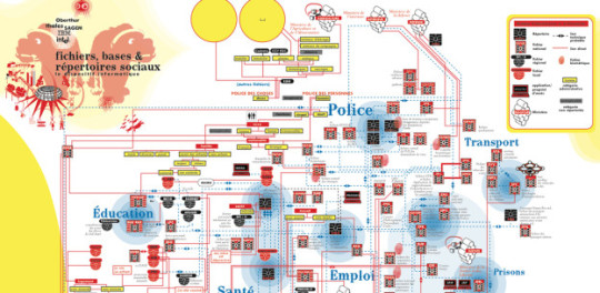
#cartographie des #fichiers - Bureau des études
▻http://alireailleurs.tumblr.com/post/135311780588
Le Bureau des études, un collectif d’artistes et d’activistes mené par Léonore Bonaccini et Xavier Fourt, a publié en janvier une très intéressante cartographie (.pdf) des systèmes d’identification et d’information nationaux, faisant partie d’un tout aussi intéressant Atlas des agendas, visant à ”cartographier les #pouvoirs et les communs” (dont il faut lire aussi le complément en français (.pdf) visant à dresser “l’atlas des priorités”, une lecture critique et esthétique des réseaux de pouvoir). A l’heure où les autorités envisagent des modalités d’interconnexion des fichiers, la cartographie de ceux-ci permet d’en mesurer plus que jamais le (...)

J’ai corrigé, mais ça le fait pas dans les silos. Merci !

Le lien vers le billet qui présente l’Atlas (et non vers le site)
▻http://bureaudetudes.org/2015/04/23/atlas-of-agendas-mapping-the-power-mapping-the-commons-2015
Je jette un œil rapide sur la carte présentée et je m’interroge sur ce que recouvre le « lien technique probable » entre Insee et Ministère de l’intérieur. Il y a un lien certain puisque l’Insee est chargé de la gestion du fichier électoral, fichier qui ne figure pas sur la carte, pas plus que les fichiers des impôts (DAS1) ou des CAF auxquels l’Insee accède à des fins statistiques.

Carte réalisée avec la revue Z n°5 en 2011 sur le travail social :
►https://reflets.info/mecanisation-des-rapports-sociaux
Le dossier était accompagné d’une critique de l’informatisation du service 115 d’aide aux personnes à la rue à travers le dispositif du SIAO :
A noter que les progiciels commerciaux (Progdis, Iodas, Praxtel, Ophelia…) devront être « compatibles » avec le SIAO pour accélérer les interconnexions. Selon un précieux « cahier des charge fonctionnel », document qui date de juillet 2009, le SIAO n’a pas seulement une visée comptable et mécanique de l’hébergement d’urgence. Il doit aussi intégrer des éléments « pédagogiques » pour qu’il soit mieux « accepté », par les agents qui l’utilisent comme par ceux qui en sont la cible :
les Travailleurs sociaux constituent un point d’entrée quasiment exclusif des informations concernant les individus ; de ce fait, il faudra s’assurer non seulement de leur acceptation du nouvel outil comme support quotidien pratique et adapté, (et donc en cas d’application nouvelle, l’acceptation du principe d’une resaisie) mais également de leur adhésion à l’argumentaire justifiant cette base d’individus : l’analyse des demandes, des parcours, des devenirs… pour une mise en adéquation constante du dispositif.
D’autre part, la collaboration active de chaque établissement sera nécessaire pour un suivi quotidien des capacités disponibles ; il faudra donc, parmi les messages à prévoir dans le plan de Conduite du changement, décrire précisément les fonctionnalités très opérationnelles et l’utilité du système […]. Globalement, la sémantique (définition des termes, zoom sur les cas particuliers ambigus…) sera à harmoniser grâce à l’Administration Centrale, et transmise grâce à un dispositif pédagogique par les Services Déconcentrés.
[…] Il faudra également prendre en compte le besoin d’obtenir rapidement une version (…) opérationnelle et rendant un service à chaque type d’acteur, afin d’aider à l’adhésion de ceux-ci, d’éviter l’« effet tunnel », et d’amorcer, grâce à cette première image positive, un effet d’entraînement contribuant au succès du déploiement, à la vivacité du dépôt de données, et à la réussite de versions ultérieures.
The Search for a Radical Cartography | Denil | Cartographic Perspectives
▻http://cartoperspectives.org/index.php/journal/article/view/cp68-denil/14
Voilà un texte superbe et fort à propos ! #cartoexpériement #cartographie_radicale #cartographie #sémiologie
▻http://cartoperspectives.org/index.php/journal/article/viewFile/6/14/60.jpg
A number of recent map publications have incorporated terms like Radical, Counter, and Alternative in their titles, but it is unclear exactly what a radical (or counter, or alternative) cartography would be. This paper postulates some characteristics such a cartography (termed radical for convenience) might possess, and explores analogous phenomena in other fields, in search of a paradigm or model for recognizing cartographic radicality.
The term mapicity is proposed to instantiate that quality which all maps must possess in order to be recognized and employed as maps, and the term radicality is introduced to identify a quality that would set a radical cartography apart from one that was not radical.
Three collections of maps that are identified by their authors or publishers as radical are examined for traces of radicality as defined in this paper. In addition, the early Twentieth Century painting movement Analytic Cubism (approximately 1907–1914) is forwarded as a model or paradigm for radicality.
Signalé dans "Forbes Brasil" et "La Fabrique de l’histoire"
« Quand tu veux comprendre le présent, demande-toi : Et le passé ? »
►https://www.youtube.com/watch?v=LJtUQjJC4a0
▻http://www.forbes.com.br/videos/2015/11/entenda-em-10-minutos-como-nasceu-a-crise-no-oriente-medio-que-chegou-a-franca/?ogimage=default
Ce film cartographique de dix minutes est un chef d’oeuvre. Vu sur youtube un peu moins de 3 millions de fois (mais ce n’est pas un critère... ha ! ha ! ), la vidéo revisite l’histoire du Moyen-Orient par une narration rapide et une série d’esquisses dessinées en live. Le rythme est sans doute trop rapide et pour acquérir les connaissances, il faut regarder une deuxième fois et s’arrêter souvent pour avoir le temps de faire les liens entre les étapes historiques. Quelques défauts donc, mais un mode carto-narratif vraiment très très intéressant et une approche novatrice et originale.
que ocorre exatamente na Síria? De onde vêm mais de quatro milhões de refugiados? Foram essas perguntas que incentivaram o grupo #WhyMaps a fazer um vídeo, no começo de outubro, que explica em pouco mais de 10 minutos e 15 mapas a história da Síria e da região, que têm sido o centro das atenções do mundo neste ano, em grande parte graças ao grupo terrorista Estado Islâmico (Isis).
#syrie #moyen-orient #proche-orient #histoire #monde_musulman

En mettant en pause toutes les 10s, c’est très intéressant. :)
#cartographie #cartographie_radicale

un vrai chef d’oeuvre d’éduc pop géopolitique
par contre les sous titres Fr laissent à désirer. seis cientos años : soixante ans. ahem.
Which Europe? Migrants’ uneven geographies and counter-mapping at the limits of representation
Looking at three snapshots of migrant struggles in Europe, this paper deals with the limits and the challenges of representing migration. Starting from that, it investigates the theoretical and political challenges of mapping migration – both as a cartographic practice and as a form of narrative. The article mobilizes a #counter-mapping analytics which looks at the European space through the spatial transformations generated by migration movements.
►http://movements-journal.org/issues/02.kaempfe/04.tazzioli--europe-migrants-geographies-counter-mapping-represen
#cartographie_radicale #migrations #asile #réfugiés #cartographie #visualisation #counter_mapping
cc @reka
Million Dollar Blocks project - Laura Kurgan
▻http://spatialinformationdesignlab.org/projects/million-dollar-blocks
Chicago’s Million Dollar Blocks
Illinois allocates an incredible amount of money to incarcerate people from Chicago’s poorest neighborhoods — sometimes millions for residents on individual city blocks. There are more effective ways to invest public dollars.
et le désormais traditionnel #making-of
▻https://source.opennews.org/en-US/articles/how-we-made-homan-square-portrait
La Fin des cartes ? | Territoires rêvés, territoires normalisés
L’Université Paris 1 Panthéon-Sorbonne organise un colloque international et, en partenariat avec Kareron, un parcours d’expositions conçu par Isabelle Arvers. Ces deux temps forts de la Biennale Némo viennent conclure le programme art et recherche La Fin des Cartes ? Territoires rêvés, territoires normalisés, initié en 2013. La Fin des Cartes ? débute à Paris le 18 novembre avec un vernissage à l’Espace des Arts sans Frontières qui inaugure ainsi le parcours d’exposition. Le colloque international a lieu les 19 et 20 novembre à l’École Nationale Supérieure d’Architecture de Paris-Belleville. Un pré-vernissage aura lieu le 12 novembre au Shakirail, le parcours d’exposition continue ensuite à l’Espace Khiasma, Immanence, et à l’École Nationale d’Architecture de Paris-Belleville.
ET le colloque !
Colloque – 19-20 novembre 2015 | La Fin des cartes ?
▻http://lafindescartes.net/evenements/colloque
Point d’orgue du processus engagé, le colloque international, prévu sur deux jours en novembre 2015, reflétera les rencontres ayant eu lieu pendant ces deux années de travaux. Les résultats des recherches menées par l’équipe de travail mobile seront confrontés aux regards et aux travaux des intervenants extérieurs.
Ce colloque porte le titre d’un programme de recherche qui s’étend depuis septembre 2013 sous forme de workshops, de journées d’études, de tables rondes, de projections, de conférences, de groupe de travail itinérant et d’expositions. Il réunit des chercheurs de tous bords et se déploie lui-même telle une carte ouverte, accueillant différents parcours et acceptant de modifier les itinéraires à mesure qu’ils se dessinent. La restitution de ces travaux alimentera un ouvrage à paraître en 2016 et se prolonge actuellement dans le développement de la base de données Altermapping Knowledge Base (AMKB). La Fin des cartes ? vise, à l’heure de la multiplication des procédés cartographiques 2D et 3D à interroger la représentation des territoires tant d’un point de vue technologique, scientifique, que politique, urbanistique et artistique.

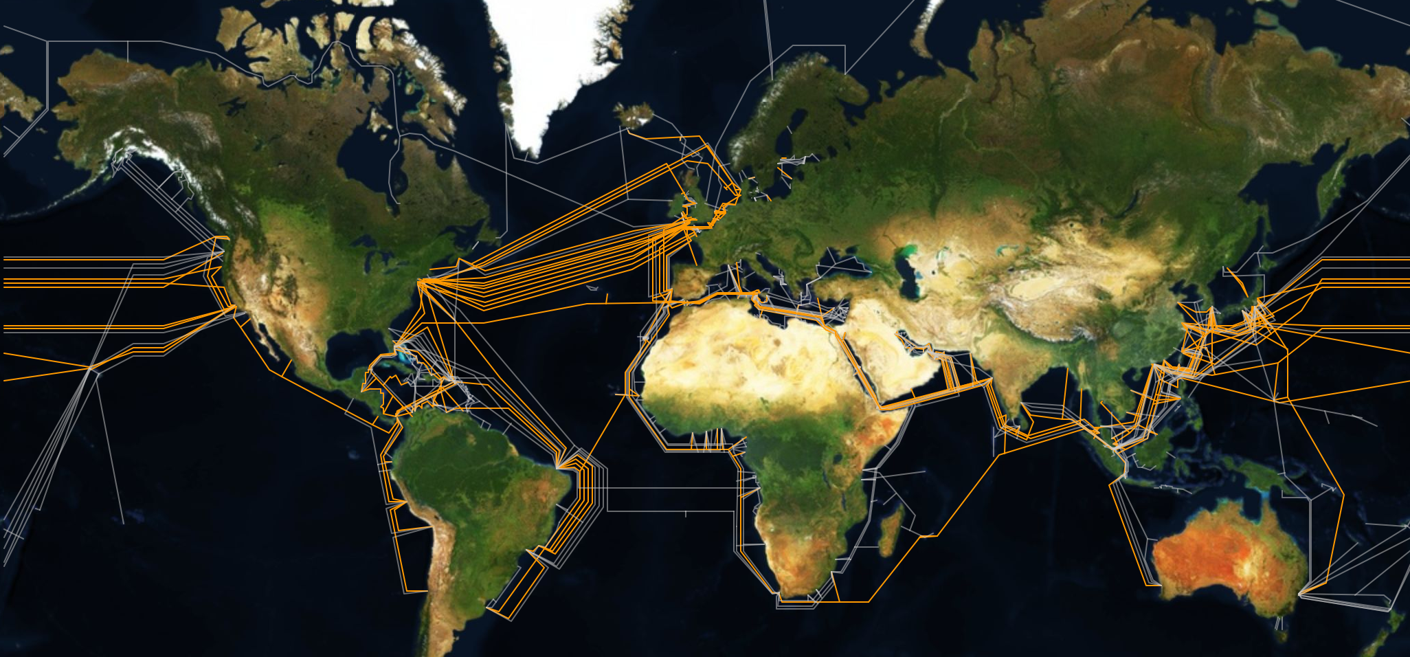
Photographier les #câbles_sous-marins
▻https://www.mediapart.fr/journal/culture-idees/130915/photographier-les-lieux-de-la-surveillance-de-masse
▻https://www.vice.com/read/the-map-is-the-territory-0000742-v22n9
Trevor Paglen, qui a par ailleurs été directeur de la #photographie pour le documentaire de Laura Poitras consacré à Edward Snowden, Citizen Four, s’est donc mis à photographier les « lieux » de la #surveillance. Lors de ses précédents projets, il avait pris des clichés de stations d’écoute de la NSA, une zone de test d’armes chimiques et biologiques ou encore une prison secrète en Afghanistan.
Pour sa nouvelle exposition, Trevor Paglen s’est plus particulièrement intéressé aux câbles sous-marins acheminant le trafic internet d’un continent à un autre et sur lesquels les services de renseignement se branchent directement pour intercepter en masse des communications.
je viens de me réabonner à toi, tiens ! Puisque je vois que le taux de post pour le ..... à sensiblement diminué, c’est moins risqué.

watch?v=9Igfu0VwdkQ#t=326 In USA that secrecy infrastructure is vast, it’s also call Black Project … and it’s around fifty or sixty billions dollars* a year …
*60 milliards de dollars (EDIT: calcul)
#chiffres_de_la_surveillance
This tube map shows how inaccessible the Underground is
▻http://www.timeout.com/london/blog/this-tube-map-shows-how-inaccessible-the-underground-is-081915
But let’s get serious for a minute, because this alternative tube map shows how many stations have wheelchair access, and as you can see, it’s looking pretty sparse. The map is the work of London-based creative team Olivia and Irene, the duo who created the brilliant alternative tube badges and have now turned their hand to a more serious cause with this project.
▻http://cargocollective.com/oliviaandirene/Wheelchair-Access
After traveling on the tube with a giant suitcase we realised how impossible it must be for people in a wheelchair to get around London.
We created a version of the tube map showing only the stops with disabled access, the results are shocking.
Cartographies Subjectives I
Une expo organisée par le Syndicat Potentiel
C’est à Strasbourg et ils viennent tout juste de me signaler leur existence et l’ouverture de cette expo qui promet (dommage que je ne l’ai pas su avant, je me serai organisé pour y aller). Superbe initiative, et je m’impatiente de faire connaissance avec cette équipe !
Ils ont aussi un scoop.it très riche en signalements et info diverses :
▻http://www.scoop.it/t/art-et-cartographie
▻https://www.facebook.com/events/1923958284496120
François Bauer, Gladys Bourdon, Marie Bouts, Bureau d’études, Marta Caradec, Armelle Caron, Yann Coiffier, Fabien Fischer, Marine Froeliger, Lucie Guillemin, Guillaume Greff, Catherine Jourdan, Horizome, Benoit Perez, Marie Quéau, Sabine Réthoré, Till Roeskens
& Marion Turbat, Julia Trouillot, Vincent Schueller
L’exposition rassemble des cartographies produites par des artistes, créateurs, chercheurs...
À mi-chemin entre création artistique et outil de visualisation géographique, la cartographie subjective se révèle ici dans ses versants urbanistiques, sociologiques, poétiques, géopolitiques ou même intimes. Les cartes agissent ainsi comme autant de mises en lumière de comment nous vivons ou percevons les multiples espaces qui nous environnent.
EXPOSITION
DU 25 SEPT AU 17 OCT 2015 MAR—SAM 15h—19h
VERNISSAGE
JEUDI 24 SEPT À 18h
Cartographies Subjectives I est présentée par le Syndicat Potentiel dans le cadre des Journées de l’Architecture
Cartographies Subjectives II, sa suite, sera présentée du 21 au 12 décembre 2015, dans le cadre du Festival Strasbourg-Méditerranée
L’exposition bénéficie de prêts de l’Artothèque de la Ville de Strasbourg
Crédit visuel Recto : Catherine Jourdan / Projet de Géographie Subjective avec le MUDAM. 2012 (extrait)
►http://syndicatpotentiel.free.fr
Photo de Syndicat Potentiel Strasbourg.
Beaucoup de projets pour #cartoexperiment #cartographie_subjective #cartographie_radicale

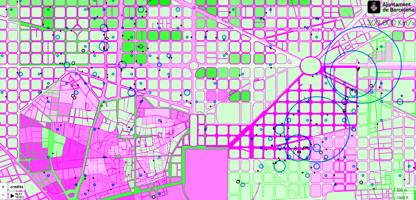
geographies of innovation
▻http://innovation.300000kms.net/#441
signalé par @isskein que je remercie
geographies of innovation
map of innovative initiatives in Barcelona
Innovation occurs in education, civic organization and economy as the result of multiple social, financial and urban factors. This map explores innovative initiatives in Barcelona, where they are located, how they cluster in urban space and which sector of activity they belong to.
By exploring four different layers, you can examine several aspects that significantly influence the location of these innovative initiatives: sociodemographic context, urban fabric, functional indicators and spatial organisation (network).
#cartographie_radicale #innovation #cartographie_participative


Refugee Map Belgrade Serbia HELP AID

l’art de digérer les flux sur les ensembles mal aimés puis avant le bout de gondole transformer l’accueil en site de rencontre du tralala métisseur

Et pour la région des Balkans :
Refugee Help map
#aide #carte #Balkans
via @luciebacon
US college student creates ’Refugee Help Map’
David Altmayer was studying in Budapest, Hungary, when the refugee crisis broke out. So he designed an interactive online map that shows where the refugees are and what they need.
Simon Evans & Öyvind Fahlström - Kunsthalle Düsseldorf
▻http://www.kunsthalle-düsseldorf.de/index.php?id=331
traveller. Evans largely produces psycho-geographical maps that enable him to define his own standpoint and locate himself within his environment; starting from the personal, putting his finger on general human shortcomings and desires.
Fahlström is interested in the laws governing the collective that are reflected in pop cultural pictorial worlds and in the accumulation of political and economic data. He composed paintings and installations from variable elements and formed politically charged information into complex geopolitical maps that relentlessly reveal global injustices. The variability of the elements, the game as the basis of the artwork clearly shows that the world can fundamentally be altered by the individual. Both Fahlström and Evans motivate the viewer to rethink his own position, whether within the global play of power or in the everyday. And the two artists also make generous use of sarcasm and irony in their analyses, with the result that Evans is far removed from any and all form of sentimental self-adulation and Fahlström’s work does not approach the realm of political propaganda. The formal ingenuity of the artists, both of whom utilise collage techniques and fragmentation, is likewise fascinating in equal measures. Fahlström treats the overabundance of visual information in compositionally condensed labyrinthal structures, combining appropriated images with fictitious forms or creating nearly dreamlike sequences when, for example, the swimming figures from Green Pool come together in ever new constellations. Like his associative observations, Evans’ works have an almost ephemeral and delicate character. Just as the external and internal world overlap in the collages, countless layers of text and image similarly overlap. Tiny snippets of paper cut out of notebooks, everyday elements, drawings,
Greenwich Emotion Map | Flowing City, Urban Data visualizations of the city
▻http://flowingcity.com/visualization/greenwich-emotion-map
How was the Greenwich
Emotion Map created?
The Bio Mapping device was invented by the artist Christian Nold. It combines a finger cuff sensor, which records the wearer’s Galvanic Skin Response (GSR) – an index of emotional response – in conjunction with a Global Positioning System (GPS) which locates the wearer’s position on earth.
The finger cuff sensor was derived from the Polygraph, where it is used by law enforcement agencies to identify the physiological symptoms of stress induced by lying. Bio Mapping uses this technology very differently.
Instead of handing over one’s own biometric data to an authority for judging, Bio Mapping empowers the participants to interpret their body’s metrics in a more subtle way for themselves. From a common starting point the participants would walk for up to an
hour wherever they wanted in the local area. On returning to the workshop base, they could see their walk represented visually as a personal ‘emotion map’.
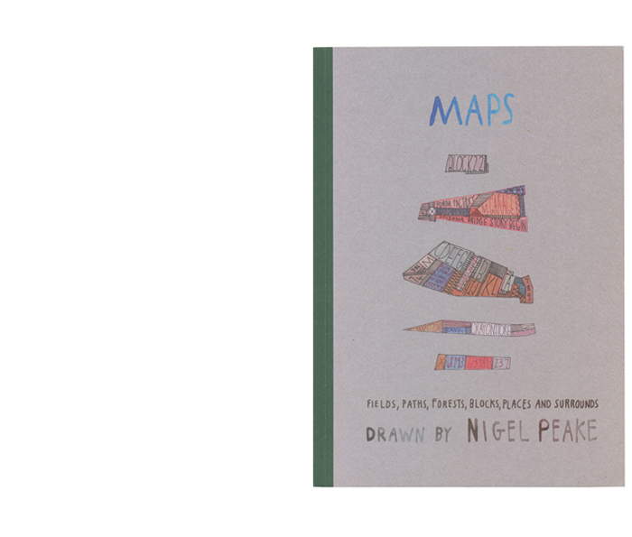
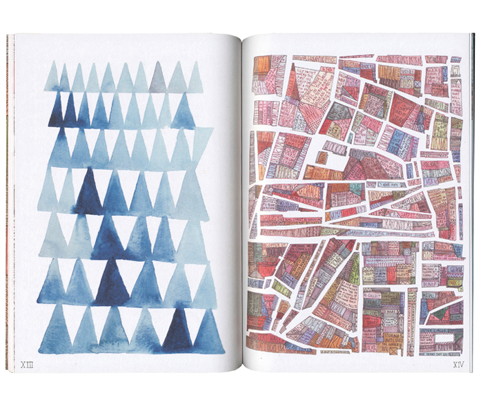
Maps | Nigel Peake
▻http://www.nigelpeake.com/books/2008/maps
Maps
Fields, Paths, Forests, Blocks,
Places And Surrounds
32 Pages
148 X 210mm
ISBN 9780955628412
The Paper Architecture of Brodsky and Utkin | A Journey Through Slavic Culture
▻https://russianculture.wordpress.com/2011/01/12/the-paper-architecture-of-brodsky-and-utkin
 https://russianculture.files.wordpress.com/2011/01/monument-to-2000-1997.jpg
  https://russianculture.files.wordpress.com/2011/01/picture-7.jpg?w=106
 via Kate Fletcher
The Paper Architecture of Brodsky and Utkin
Posted on January 12, 2011 | 5 Comments
Aleksandr Brodsky and Ilya Utkin have today become known in the Russian art world for their intriguing works of architecture, ranging from everything such as a sculpture to a artistically repurposed building or shed, but what they are probably most known for are several copper plate etchings they created displaying fantastical archictectural designs, a product of their lives and experiences as architects in a time when reform was present and ideas were ever-changing. Their story and the inspiration behind the drawings is probably best said in the book written on these drawings:
La « carte modeste » d’Hervé Di Rosa
Présentation des œuvres protéiformes créées au gré des voyages du peintre inventeur de l’Art Modeste, né à Sète en 1959. Expositions, actualité et biographie.
« Je n’invente pas l’art modeste, je l’ai trouvé, je le fais vivre et je le fais dialoguer avec l’art contemporain. Le centre de cette aventure, c’est l’art contemporain. Parce qu’en face, il y avait le Centre régional d’art contemporain, de grande importance, on a longtemps cru que le Miam était un lieu anti-art contemporain. Pas du tout. Au contraire, j’ai fondé le Miam pour tendre un pont d’une rive à l’autre, aller vers le néophyte qui peut être attrapé par l’alibi des images du quotidien qu’il connaît bien et qui l’amènent vers des œuvres plus complexes. Certains vont vouloir approfondir et aller voir de l’autre côté. »
Je suis juste en train de classer des archives et je retrouve cette image que j’avais référencée en local il y a très longtemps

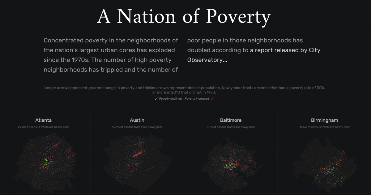
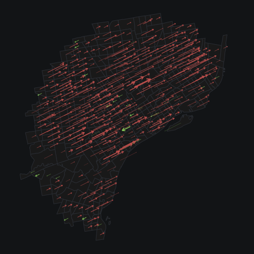
A Nation of Poverty
▻http://labratrevenge.com/nation-of-poverty
Concentrated poverty in the neighborhoods of the nation’s largest urban cores has exploded since the 1970s. The number of high poverty neighborhoods has tripled and the number of poor people in those neighborhoods has doubled according to a report released by City Observatory...
voir aussi Exploding nation of poverty
▻http://flowingdata.com/2015/08/05/exploding-poverty
#cartographie_radicale #variations #visualisation

WOW !
Seamless Transitions
#Seamless_Transitions is a visualisation of three spaces of immigration judgement, detention and deportation in the UK. Field House in the City is the home of the Special Immigration Appeals Commission (SIAC), designed around the presentation of secret evidence, Harmondsworth IRC at Heathrow is just one part of the UK’s detention estate, and the Inflite Jet Centre at Stansted is where I watched the deportation flights take place in December 2013 – and where they still carry on.
L’interview de #James_Bridle :
#film #détention_administrative #aéroport #asile #migration #expulsion #renvoi #lieux_de_détention #UK #Angleterre #architecture #visualisation #espace #limbe #invisibilité #visibilité #visible #invisible #reconstruction
cc @reka @albertocampiphoto @fil
Seamless Transitions
Seamless Transitions is a new exhibition by the artist, writer and technologist James Bridle, which opens at the Photographer’s Gallery in London on 6 February 2015.
@reka : est-ce que cela peut être considéré de la #forensic_architecture ?
lifewinning/submarine-cable-taps
attempts to map which submarine cables are tapped and where, based on Snowden documents.


